D3 Visualization Margins
Add margins to a D3 visualization.
Follow D3 Bar Chart Title and Labels to set the examples below.
Adding Margins
The label for the y Axis is too close to the left. I had to plug a few different numbers in .attr("y", 15) to make it fit.
// Label for y Axis
svg.append("text")
   .attr("transform", "rotate(-90)")
   .attr("x", -(h/2))
   .attr("y", 15)
   .style("text-anchor", "middle")
   .text("Population");
We can add the margins like this:
var margin = {top: 20, right: 20, bottom: 20, left: 20},
    w = 500 - margin.left - margin.right,
    h = 300 - margin.top - margin.bottom;
Perhaps the labels are too big. They are the same size as the title. I added a font size for the labels, changed the position of the y label, and added the margins.
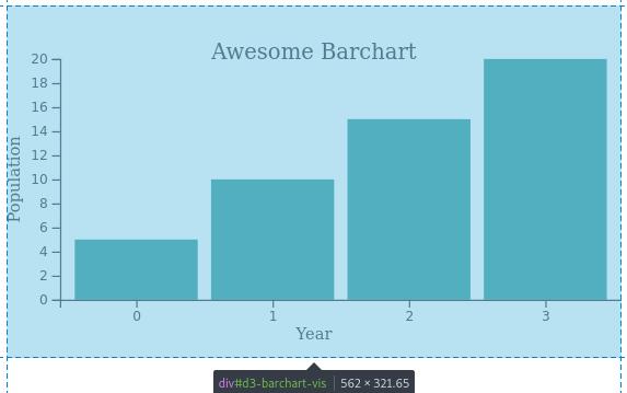
The barchart looks like this:
Updated code with margins
    var margin = {top: 20, right: 20, bottom: 20, left: 20},
            w = 500 - margin.left - margin.right,
            h = 300 - margin.top - margin.bottom;

    var barPadding = 3;
    var padding = 40;
    var svg = d3.select("#d3-barchart-vis")
                .append("svg")
                .attr("preserveAspectRatio", "xMinYMin meet")
                .attr("viewBox", "0 0 " + w + " " + h);

    var parseTime = d3.timeParse("%Y");

    var rowConverter = function(d) {
        return {
            year: parseTime(d.year),
            population: +d.population
        }
    }

    d3.csv("file.csv", rowConverter).then(function(dataset) {

        xScale = d3.scaleBand()
                   .domain(d3.range(dataset.length))
                   .rangeRound([padding, w])
                   .paddingInner(0.1)
                   .paddingOuter(0.1);

        yScale = d3.scaleLinear()
                   .domain([0, d3.max(dataset, function(d) { return d.population; })])
                   .range([h - padding, padding]);

        var xAxis = d3.axisBottom(xScale);
        var yAxis = d3.axisLeft(yScale);

        svg.selectAll("rect")
           .data(dataset)
           .enter()
           .append("rect")
           .attr("x", function(d, i) {
               return xScale(i);
           })
           .attr("y", d => yScale(d.population))
           .attr("width", xScale.bandwidth())
           .attr("height", d => h - padding - yScale(d.population))
           .attr("fill", "teal");

        // Add the x Axis
        svg.append("g")
           .attr("class", "x axis")
           .attr("transform", "translate(0," + (h - padding) + ")")
           .call(xAxis);

        // Label for x Axis
        svg.append("text")
           .attr("transform", "translate(" + (w/2) + " ," + (h-10) + ")")
           .style("text-anchor", "middle")
           .style("font-size", "12px")
           .text("Year");

        // Add the y Axis
        svg.append("g")
           .attr("class", "y axis")
           .attr("transform", "translate(" + padding + ",0)")
           .call(yAxis);

        // Label for y Axis
        svg.append("text")
           .attr("transform", "rotate(-90)")
           .attr("x", -(h/2))
           .attr("y", 10)
           .style("text-anchor", "middle")
           .style("font-size", "12px")
           .text("Population");

        svg.append("text")
           .attr("x", w/2)
           .attr("y", padding)
           .attr("text-anchor", "middle")
           .style("font-size", "16px")
           .text("Awesome Barchart");
    });