D3 Adding Axes to Bar Chart
Adding axes to a bar chart in D3.
Follow:
D3 axes in bar chart
Use any of these: d3.axisTop, d3.axisBottom, d3.axisLeft, d3.axisRight. Then append a g (group) element to the end of the SVG.
var xAxis = d3.axisBottom(xScale);
var yAxis = d3.axisLeft(yScale);
Put this at the end of the script, since the graphics lay on top of each other, making the axes the last visible graph at the top of the SVG.
svg.append("g")
   .attr("class", "axis")
   .attr("transform", "translate(0," + (h - padding) + ")")
   .call(xAxis);

svg.append("g")
   .attr("class", "axis")
   .attr("transform", "translate(" + padding + ",0)")
   .call(yAxis);
This line is a string concatenation:
.attr("transform", "translate(0," + (h - padding) + ")")
It computes to the following:
.attr("transform", "translate(0", + (300 - 40 ) + ")")
Then the result is:
svg.append("g")
   .attr("class", "axis")
   .attr("transform", "translate(0,260)")
   .call(xAxis);
The translate function moves the object by x and y. More details in the MDN Web Docs.
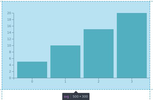
The bar chart should look like this:
Updated Code
  var w = 500;
  var h = 300;
  var barPadding = 3;
  var padding = 40;
  var svg = d3.select("#d3-barchart-vis")
              .append("svg")
              .attr("preserveAspectRatio", "xMinYMin meet")
              .attr("viewBox", "0 0 " + w + " " + h);

  var parseTime = d3.timeParse("%Y");

  var rowConverter = function(d) {
      return {
          year: parseTime(d.year),
          population: +d.population
      }
  }

  d3.csv("file.csv", rowConverter).then(function(dataset) {

      xScale = d3.scaleBand()
                 .domain(d3.range(dataset.length))
                 .rangeRound([padding, w])
                 .paddingInner(0.1)
                 .paddingOuter(0.1);

      yScale = d3.scaleLinear()
                 .domain([0, d3.max(dataset, function(d) { return d.population; })])
                 .range([h - padding, padding]);

      var xAxis = d3.axisBottom(xScale);
      var yAxis = d3.axisLeft(yScale);

      svg.selectAll("rect")
         .data(dataset)
         .enter()
         .append("rect")
         .attr("x", function(d, i) {
             return xScale(i);
         })
         .attr("y", d => yScale(d.population))
         .attr("width", xScale.bandwidth())
         .attr("height", d => h - padding - yScale(d.population))
         .attr("fill", "teal");

      svg.append("g")
         .attr("class", "x axis")
         .attr("transform", "translate(0," + (h - padding) + ")")
         .call(xAxis);

      svg.append("g")
         .attr("class", "y axis")
         .attr("transform", "translate(" + padding + ",0)")
         .call(yAxis);
  });
Adding ticks on the Axes
Use .ticks().
However, D3 will override this if it wants to divide the input domain evenly.
Use .tickValues([an array of values]) to set them manually.
Use .tickFormat to format the axis labels.
var xAxis = d3.axisBottom(xScale)
              .ticks(someParameterHere);
Troubleshooting the Year on the x Axis
The barchart still doesn’t look correct. The ticks on the x Axis are supposed to be years and not integers starting at 1.
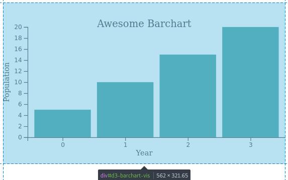
Modify the scaleBand() so the domain maps to the years on the converted Date objects from the CSV file.
It currently looks like this:
xScale = d3.scaleBand()
           .domain(d3.range(dataset.length))
           .rangeRound([padding, w])
           .paddingInner(0.1)
           .paddingOuter(0.1);
Changed to this:
xScale = d3.scaleBand()
           .domain(dataset.map(d => d.year.getFullYear()))
           .rangeRound([padding, w])
           .paddingInner(0.1)
           .paddingOuter(0.1);
You can test what this does on the console dataset.map(d => d.year.getFullYear()) inside this section:
d3.csv("file.csv", rowConverter).then(function(dataset) {
    console.log(dataset.map(d => d.year.getFullYear()))
The output should be:
Array(4) [ 1950, 1951, 1955, 1959 ]
Then modify implementing the xScale in this section. From this return xScale(i):
svg.selectAll("rect")
   .data(dataset)
   .enter()
   .append("rect")
   .attr("x", function(d, i) {
       return xScale(i);
   })
   .attr("y", d => yScale(d.population))
   .attr("width", xScale.bandwidth())
   .attr("height", d => h - padding - yScale(d.population))
   .attr("fill", "teal");
Modified to this return xScale(d.year.getFullYear()):
svg.selectAll("rect")
   .data(dataset)
   .enter()
   .append("rect")
   .attr("x", function(d, i) {
       return xScale(d.year.getFullYear());
   })
   .attr("y", d => yScale(d.population))
   .attr("width", xScale.bandwidth())
   .attr("height", d => h - padding - yScale(d.population))
   .attr("fill", "teal");
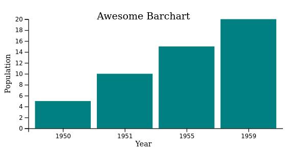
The corrected barchart looks like this:
Click to view updated code
  var margin = {top: 20, right: 20, bottom: 20, left: 20},
        w = 500 - margin.left - margin.right,
        h = 300 - margin.top - margin.bottom;

  var barPadding = 3;
  var padding = 40;
  var svg = d3.select("#d3-barchart-vis")
              .append("svg")
              .attr("preserveAspectRatio", "xMinYMin meet")
              .attr("viewBox", "0 0 " + w + " " + h);

  var parseTime = d3.timeParse("%Y");

  var rowConverter = function(d) {
      return {
          year: parseTime(d.year),
          population: +d.population
      }
  }

  d3.csv("file.csv", rowConverter).then(function(dataset) {

    xScale = d3.scaleBand()
               .domain(dataset.map(d => d.year.getFullYear()))
               .rangeRound([padding, w])
               .paddingInner(0.1)
               .paddingOuter(0.1);

    yScale = d3.scaleLinear()
               .domain([0, d3.max(dataset, d => d.population)])
               .range([h - padding, padding]);

    var xAxis = d3.axisBottom(xScale);
    var yAxis = d3.axisLeft(yScale);

    svg.selectAll("rect")
       .data(dataset)
       .enter()
       .append("rect")
       .attr("x", d => xScale(d.year.getFullYear()))
       .attr("y", d => yScale(d.population))
       .attr("width", xScale.bandwidth())
       .attr("height", d => h - padding - yScale(d.population))
       .attr("fill", "teal");

    // Add the x Axis
    svg.append("g")
       .attr("class", "x axis")
       .attr("transform", "translate(0," + (h - padding) + ")")
       .call(xAxis);

    // Label for x Axis
    svg.append("text")
       .attr("transform", "translate(" + (w/2) + " ," + (h-10) + ")")
       .style("text-anchor", "middle")
       .style("font-size", "12px")
       .text("Year");

    // Add the y Axis
    svg.append("g")
       .attr("class", "y axis")
       .attr("transform", "translate(" + padding + ",0)")
       .call(yAxis);

    // Label for y Axis
    svg.append("text")
       .attr("transform", "rotate(-90)")
       .attr("x", -(h/2))
       .attr("y", 10)
       .style("text-anchor", "middle")
       .style("font-size", "12px")
       .text("Population");

    svg.append("text")
       .attr("x", w/2)
       .attr("y", padding)
       .attr("text-anchor", "middle")
       .style("font-size", "16px")
       .text("Awesome Barchart");
  });