D3 Tutorial for Data Visualization
This is a detailed D3 tutorial for data visualization. Setup D3, build a barchart, and responsive D3. Updated June 2020.
Resources:
- D3 Troubleshooting
- Interactive Data Visualization for the Web, 2nd Ed
- D3 Official Website
- D3 Examples at Popular Blocks
- Blog, from the creator of D3
- D3 API Docs
- D3 Making a Map
- D3 Data Wanderings Blog
- D3 Making a Slider
- SVG Reference
- Managing colors in D3
- Color Brewer for Maps
- Python HTTP Server
- D3.js on Jekyll
- D3.js charts responsive
- Create a responsive bar chart with D3.js
- JavaScript Date Object
D3 Version and Compatibility
Different versions of D3 don’t play along well. If you are following a book or tutorials, make sure to check which version of D3 is used or some things won’t work as expected.
Setting up D3
First create three files, name them as you think is best, for example:
index.htmlmain.cssproject.js
Download the D3.js library from D3 Website or use the external reference.
If you downloaded the file into a lib folder, then add this to your index.html:
<script type="text/javascript" src="lib/d3.min.js"></script>
If you want to use an external reference use one of these, depending on the version:
<script type="text/javascript" src="https://d3js.org/d3.v4.min.js"></script>

<script type="text/javascript" src="https://d3js.org/d3.v5.min.js"></script>
Create an HTML template
Here is an HTML template example including the references to main.css and project.js. I also recommend putting a favicon so you can quickly find the tab. I downloaded a favicon and saved it as icon.png
<!DOCTYPE html>
<html lang="en">
    <head>
        <meta charset="utf-8">
        <title>D3 Canvas</title>
        <link rel="icon" type="image/png" href="icon.png">
        <script type="text/javascript" src="https://d3js.org/d3.v5.min.js"></script>
        <link rel="stylesheet" type="text/css" href="main.css">
    </head>
    <body>
        <script type="text/javascript" src="project.js"></script>
    </body>
</html>
Example of a D3.js file
This is an example of some of a D3 Javascript file just to see what it looks like:
var w = 700;
var h = 500;
var barPadding = 3;
var padding = 40;
var parseTime = d3.timeParse("%Y");
var formatTime = d3.timeFormat("%Y");

var svg = d3.select("body")
            .append("svg")
            .attr("width", w)
            .attr("height", h);

var rowConverter = function(d) {
    return {
        year: parseTime(d.year),
        total: +d.running_total
    };
}
Run a web server with Python
In your project folder, run the web server with Python.
Run it like this if you want the process to run in the background with &.:
$ python -m http.server 8888 --bind 127.0.0.1 &.
Or like this if you want to see the output. With --bind to explicitly use localhost only:
$ python -m http.server 8888 --bind 127.0.0.1
Then open the browser on http://127.0.0.1:8888/ and browse to the index.html:
Serving HTTP on 127.0.0.1 port 8888 (http://127.0.0.1:8888/)
127.0.0.1 - - [06/Jun/2020 08:24:06] "GET /index.html HTTP/1.1" 200 -
127.0.0.1 - - [06/Jun/2020 08:24:06] "GET /main.css HTTP/1.1" 200 -
127.0.0.1 - - [06/Jun/2020 08:24:06] "GET /project.js HTTP/1.1" 200 -
On the browser verify that you see the <title> tag from the template:
<title>D3 Canvas</title>
Stop the server with Ctrl C.
CDD or Console Driven Development
It’s a good idea to follow a Console Driven Development approach as you make changes to your files html, js, and css. When you interact with the visualization, you can see the result in the console and see if it works as expected.
Go to the browser, right click Inspect and find the Console.
The dataset
For this tutorial, I am using a CSV file called file.csv that has year and population as shown:
year,population
1950,5
1951,10
1955,15
1959,20
About Asynchronous
JavaScript runs asynchronous. Here is a good explanation about it:
How do I return the response from an asynchronous call?
The answer provides a great analogy for synchronous and asynchronous.
Synchronous is like making a phone call to tech support to fix your Internet. While they figure out the problem, you wait on the call, until the problem is solved then you end the call.
Asynchronous is making the same phone call. Instead of waiting on the call you ask them to call you back when they fix the problem. You end the call, go about your day, then wait for them to call back.
I assume that asynchronous on an app means if you are loading a page, it will load the html, the css, the js. If there is a feature that is not working, only that feature won’t load. If you change the data on a feature, then you won’t have to reload the page, the feature changes as you interact with the features.
About Anonymous functions
If you know Python, this is like a lambda function.
This is what loading a CSV in D3 v4 looks like:
d3.csv("file.csv", function(data) {
    somethingHappens(data);
});
console.log(data);
This is an anonymous callback function function(data). It runs the code inside the curly braces and then it is called back to this function.
There is a problem here. The script will continue and execute console.log(data), regardless if the data was not completely loaded. Then the console won’t display any data.
You could hack this code and perhaps put some sort of a timer but then how much time are you supposed to pass to that function?
d3.csv("file.csv", function(data) {
    somethingHappens(data);
});

someSortOfTimer(60);
console.log(data);
Instead, within the callback function, write all the code that uses the data that is loaded:
d3.csv("file.csv", function(data) {
    somethingHappens(data);
    console.log(data);
});
Loading a CSV file - Incompatible D3 versions/syntax
Loading a CSV file changes in different versions of D3 and this incompatibility is very confusing.
As shown in this blog post. There are differences loading a CSV in D3.v4 and D3.v5.
For D3.v4 you can use this syntax:
d3.csv("file.csv", function(data) {
    somethingHappens(data);
    console.log(data);
});
Let’s try this using the Console Driven Development approach. Make sure that you created these files:
index.html: Using the template as shown before.main.cssproject.jsfile.csv: Add the data as shown before
Keep in mind that the index.html is using this source https://d3js.org/d3.v5.min.js.
Add this code to project.js:
d3.csv("file.csv", function(data) {
    console.log(data);
});
Reload the browser and look at the console:
Navigated to http://127.0.0.1:8888/index.html
project.js:2 {year: "1950", population: "5"}
project.js:2 {year: "1951", population: "10"}
project.js:2 {year: "1955", population: "15"}
project.js:2 {year: "1959", population: "20"}
This works so far and we are using the source for D3.v5 instead of v4.
Clear the console with Ctrl + L or type clear() (this won’t clear if you set Preserve log).
This syntax from v4 won’t work on v5 as shown on D3 API docs. Actually this documentation is pretty confusing as it doesn’t specify which D3 version is used on the examples:
d3.csv("file.csv", function(data) {

}).then(function(data) {
  console.log(data);
});
The data is not loaded and the console shows this:
Navigated to http://127.0.0.1:8888/index.html
[columns: Array(2)]
 columns: Array(2)
     0: "year"
     1: "population"
     length: 2
     __proto__: Array(0)
     ...
     ...
This doesn’t work either:
var mydata = d3.csv("file.csv", function(data) {
});
First it returns undefined. Then calling the variable:
mydata
Shows this:
Promise {<resolved>: Array(0)}
__proto__: Promise
[[PromiseStatus]]: "resolved"
[[PromiseValue]]: Array(0)
columns: (2) ["year", "population"]
length: 0
__proto__: Array(0)
Loading a CSV file in D3.v5 with Promises
Following the previous example.
D3 version 5 uses a feature called Promises. Use this syntax:
d3.csv("file.csv").then(function(dataset) {
    console.log(dataset);
});
The console shows this:
Promise {<pending>}

(4) [{…}, {…}, {…}, {…}, columns: Array(2)]
    0: {year: "1950", population: "5"}
    1: {year: "1951", population: "10"}
    2: {year: "1955", population: "15"}
    3: {year: "1959", population: "20"}
    columns: (2) ["year", "population"]
    length: 4
    __proto__: Array(0)
Or use this syntax, it shows the same console output:
var mydata = d3.csv("file.csv")

mydata.then(function(dataset) {
    console.log(dataset);
});
Or you can load multiple datasets like this:
var data1 = d3.csv("file1.csv")
var data2 = d3.csv("file2.csv")

Promise.all([data1, data2]).then(someFunction)

function someFunction(values) {
    somethingFunHere(values);
}
More about Promises in the Observable blog.
Loading data with CSV, DSV, TSV or JSON
There are a few methods to load data:
d3.dsvthis meansdelimiter separated valuesd3.csvd3.tsvd3.json
You can use d3.dsv like this and explicitly define the separator:
d3.dsv(",", "file.csv").then(function(dataset) {
    console.log(dataset);
});
Console shows:
Promise {<pending>}

(4) [{…}, {…}, {…}, {…}, columns: Array(2)]
    0: {year: "1950", population: "5"}
    1: {year: "1951", population: "10"}
    2: {year: "1955", population: "15"}
    3: {year: "1959", population: "20"}
    columns: (2) ["year", "population"]
    length: 4
    __proto__: Array(0)
Or use d3.csv as I have shown before:
d3.csv("file.csv").then(function(dataset) {
    console.log(dataset);
});
Or use d3.json like this. Let’s create a data.json and add this:
[
  {
    "year": 1950,
    "population": 5
  },
  {
    "year": 1951,
    "population": 10
  },
  {
    "year": 1955,
    "population": 15
  },
  {
    "year": 1959,
    "population": 20
  }
]
Then load the data:
d3.json("data.json").then(function(dataset) {
    console.log(dataset);
});
Console shows the same output:
Promise {<pending>}

(4) [{…}, {…}, {…}, {…}]
    0: {year: 1950, population: 5}
    1: {year: 1951, population: 10}
    2: {year: 1955, population: 15}
    3: {year: 1959, population: 20}
    length: 4
    __proto__: Array(0)
Converting String to other Types
When loading a CSV file, the data is parsed as strings.
If this is the data contained in the CSV:
year,population
1950,5
1951,10
1955,15
1959,20
It will parse the years as strings and the population as strings. You need to convert these strings to the correct type.
year: Fromstringtodateformat.population: Fromstringtointegerformat.
Parsing and formatting the year
You can use this syntax and see the resources for more details
var parseTime = d3.timeParse("%Y");
var formatTime = d3.timeFormat(specifier);
More details here:
%Y: Parse year in decimal number such as2020.specifier: More details here- d3.timeParse
- d3.timeFormat
For now let’s add this code to our project.js:
var parseTime = d3.timeParse("%Y");
Now we need to pass a function as a parameter when loading the CSV. First we need to create the function.
A function to parse every row of the CSV file
This function is passed as a parameter of the d3.csv method. It takes every row as d. It parses the year from parseTime(d.year) and for population, it uses the + operator to force the string to numbers on +d.population.
Let’s add this to our code so now it shows this:
var parseTime = d3.timeParse("%Y");

var rowConverter = function(d) {
    return {
        year: parseTime(d.year),
        population: +d.population
    };
}
Clear the console and reload the browser. See if there are any errors in the console or in the Python server.
Loading a CSV file with rowConverter
Load the csv file and use rowConverter. Add this to project.js and reload the browser:
var parseTime = d3.timeParse("%Y");

var rowConverter = function(d) {
    return {
        year: parseTime(d.year),
        population: +d.population
    };
}

d3.csv("file.csv", rowConverter).then(function(dataset) {
    console.log(dataset);
});
This is what the code does:
- It opens
file.csvand passes the functionrowConverteras a parameter. - It takes every row using the variable
doffile.csv. - Parses the
yearfrom astringto aparseTime(d.year)format. - Parses the
populationfrom astringto an integer using the+operator+d.population. - Then print the values in the console.
The console shows:
(4) [{…}, {…}, {…}, {…}, columns: Array(2)]
    0: {year: Sun Jan 01 1950 00:00:00 GMT-0500 (Eastern Standard Time), population: 5}
    1: {year: Mon Jan 01 1951 00:00:00 GMT-0500 (Eastern Standard Time), population: 10}
    2: {year: Sat Jan 01 1955 00:00:00 GMT-0500 (Eastern Standard Time), population: 15}
    3: {year: Thu Jan 01 1959 00:00:00 GMT-0500 (Eastern Standard Time), population: 20}
    columns: (2) ["year", "population"]
    length: 4
    __proto__: Array(0)
Bind the dataset values to elements in the DOM
Now we need to use the data and bind it to elements in the DOM.
This is the cycle:
- Select
HTMLelements with.select() - Add the data with
.data() - Bind the data to elements with
.enter() - Append elements to the DOM with
.append()
Let’s add some code inside the d3.csv block:
var parseTime = d3.timeParse("%Y");

var rowConverter = function(d) {
    return {
        year: parseTime(d.year),
        population: +d.population
    };
}

d3.csv("file.csv", rowConverter).then(function(dataset) {

    d3.select("body").selectAll("p")
    .data(dataset)
    .enter()
    .append("p");
});
This is how it works:
- It selects the element
body. - Then it selects all
pelements. However, nopelements exist yet. - Use the attribute
.datato readdataset. - Use
.enter()to bind thedatasetvalues withpelements - Use
.append("p")to append thepelements to the DOM.
Stop and reload the server. Also, reload the page. It seems as if nothing happened. Since we removed console.log(dataset), there is also no output on the console.
Go to the Elements tab to see the HTML code. The body section has this now:
<body>
    <script type="text/javascript" src="project.js"></script>
    <p></p>
    <p></p>
    <p></p>
    <p></p>
</body>
It created four p tags. Let’s go back to the console and type d3.selectAll("p");:
Pt {_groups: Array(1), _parents: Array(1)}
_groups: [NodeList(4)]
_parents: [html]
__proto__: Object
Expand groups
_groups: Array(1)
0: NodeList(4) [p, p, p, p]
length: 1
Expand NodeList
0: NodeList(4)
    0: p
    1: p
    2: p
    3: p
Expand the first 0: p. It’s pretty long, scroll down to the bottom:
__data__: {year: Sun Jan 01 1950 00:00:00 GMT-0500 (Eastern Standard Time), population: 5}
__proto__: HTMLParagraphElement
Expand data:
__data__:
population: 5
year: Sun Jan 01 1950 00:00:00 GMT-0500 (Eastern Standard Time) {}
Drawing SVG
SVG stands for Scalable Vector Graphics. More info on Wikipedia. This is used to draw a sort of canvas to add the elements of our visualization.
Create the SVG element with width w and height h. Add this code to the top of the example as shown:
var w = 500;
var h = 300;
var barPadding = 3; # This will be used later for bar charts
var padding = 40; # This too
var svg = d3.select("body")
            .append("svg");
            .attr("width", w)
            .attr("height", h);

var parseTime = d3.timeParse("%Y");

var rowConverter = function(d) {
    return {
        year: parseTime(d.year),
        population: +d.population
    };
}

d3.csv("file.csv", rowConverter).then(function(dataset) {

    d3.select("body").selectAll("p")
    .data(dataset)
    .enter()
    .append("p");
});
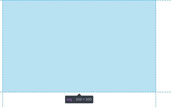
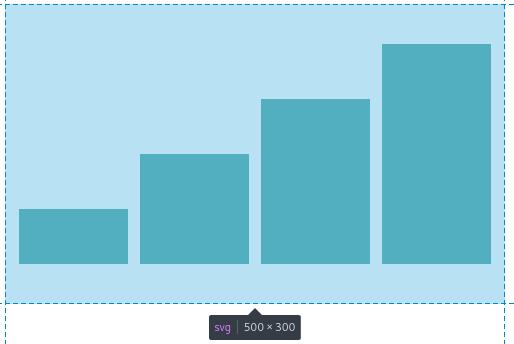
Reload the page and look at the HTML code. An svg tag has been created:
<svg width="500" height="300"></svg>
You can see the svg on the page shows a small rectangle:
(This is an image)
Creating a Bar Chart
Using the CSV dataset:
year,population
1950,5
1951,10
1955,15
1959,20
We are loading it as file.csv and we will add the bar chart code inside the callback function.
d3.csv("file.csv", rowConverter).then(function(dataset) {
    // add code here
});
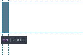
Create rectangle shapes by adding attributes for (x,y), where x is measured from left to right of the SVG and y is measured from top to bottom of the SVG. The coordinate (0,0) is the top left corner. The coordinates increase to the right for x and down for y.
Also, x points to the bottom left of the rectangle, y points to the top left of the rectangle. You are drawing kind of upside down. That’s how weird SVG is.
Drawing each rectangle for the bar chart
In this example, width draws 20px to the right, and height draws 100px downwards from the y coordinate. In other words, all rectangles of the bar chart are drawn downwards, following the characteristics of the SVG having its (0,0) on the top left corner.
(This is an image)
So far we have this:
var w = 500;
var h = 300;
var barPadding = 3;
var padding = 40;
var svg = d3.select("body")
            .append("svg")
            .attr("width", w)
            .attr("height", h);

var parseTime = d3.timeParse("%Y");

var rowConverter = function(d) {
    return {
        year: parseTime(d.year),
        population: +d.population
    }
}

d3.csv("file.csv", rowConverter).then(function(dataset) {

    svg.selectAll("rect")
       .data(dataset)
       .enter()
       .append("rect")
       .attr("x", 0)
       .attr("y", 0)
       .attr("width", 20)
       .attr("height", 100);
});
Reload the browser to see the result and the HTML:
<svg width="500" height="300">
    <rect x="0" y="0" width="20" height="100"></rect>
    <rect x="0" y="0" width="20" height="100"></rect>
    <rect x="0" y="0" width="20" height="100"></rect>
    <rect x="0" y="0" width="20" height="100"></rect>
</svg>
However by setting .attr("x", 0), it makes the bar chart rectangles to overlap on top of each other, as they are all drawn at the same (x, y) position.
Scaling the coordinates of the rectangles
The coordinates of the rectangles need to scale dynamically. For example for x values, use an anonymous function to pass each value d of the dataset, and the index i for each value. Then compute i times the width w over the length of the dataset.
Do the calculation by hand and you will understand how it works. Update the code to this and reload the browser:
var w = 500;
var h = 300;
var barPadding = 3;
var padding = 40;
var svg = d3.select("body")
            .append("svg")
            .attr("width", w)
            .attr("height", h);

var parseTime = d3.timeParse("%Y");

var rowConverter = function(d) {
    return {
        year: parseTime(d.year),
        population: +d.population
    }
}

d3.csv("file.csv", rowConverter).then(function(dataset) {

    svg.selectAll("rect")
        .data(dataset)
        .enter()
        .append("rect")
        .attr("x", function(d, i) {
            return i * (w/dataset.length);
            })
        .attr("y", function(d) {
            return h - d.population;
            })
        .attr("width", w/dataset.length - barPadding)
        .attr("height", function(d) {
            return d.population;
            })
        .attr("fill", "teal");

});
The result is this:
(This is an image)
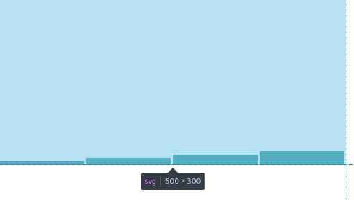
The HTML shows this:
<svg width="500" height="300">
    <rect x="0" y="295" width="122" height="5" fill="teal"></rect>
    <rect x="125" y="290" width="122" height="10" fill="teal"></rect>
    <rect x="250" y="285" width="122" height="15" fill="teal"></rect>
    <rect x="375" y="280" width="122" height="20" fill="teal"></rect>
</svg>
How this works: attr("x", function(d, i)
We need to set the x position of each rectangle. This points to the bottom left of each rectangle.
attr("x", function(d, i) {
    return i * (w/dataset.length);
})
For each value of the dataset:
year     population
1950        5
1951        10
1955        15
1959        20
The corresponding x values are as follows. Keep in mind the d values are not used for the calculation, only the index (i) of each value. First, let’s look at the indices:
   d           i (index)
[1950, 5]       0
[1951, 10]      1
[1955, 15]      2
[1950, 20]      3
The calculation (w/dataset.length) is done to evenly position each rectangle across the width w of the SVG.
wwas set before asvar w = 500lengthof the dataset is4iis used to find a starting position for each rectangle.
The calculations of i * (w/dataset.length) are.
0 * (500/4)
1 * (500/4)
2 * (500/4)
3 * (500/4)
Then they are returned to the call back function as a parameter of each x attribute.
.attr("x", 0)
.attr("x", 125)
.attr("x", 250)
.attr("x", 375)
This means the first rectangle is positioned at x = 0, then second rectangle at x = 125 and so on.
How this works: .attr("y", function(d)
We need to set the y position of each rectangle. This points to the top left of each rectangle.
.attr("y", function(d) {
    return h - d.population;
})
In this code h was previously set as var h = 300;.
The call back function is passing every row of the dataset as d and we need the second value population of each row to calculate the y coordinate of each rectangle.
return h - d.population;
Given these values, where a value of d corresponds to [d.year, d.population].
   d
[1950, 5]
[1951, 10]
[1955, 15]
[1950, 20]
The subtractions are:
300 - 5 = 295
300 - 10 = 290
300 - 15 = 285
300 - 20 = 280
For the SVG the (0,0) is at the top left. Then y value of 295 means measure 295px from top moving downwards.
These are returned to the call back function to form these:
.attr("y", 295)
.attr("y", 290)
.attr("y", 285)
.attr("y", 280)
Putting these two attributes together, we can get the coordinates for each rectangle
.attr("x", 0)        .attr("y", 295)
.attr("x", 125)        .attr("y", 290)
.attr("x", 250)        .attr("y", 285)
.attr("x", 375)        .attr("y", 280)
The rectangles are at these coordinates:
- Rectangle 1:
(0, 295) - Rectangle 2:
(125, 290) - Rectangle 3:
(250, 285) - Rectangle 4:
(375, 280)
How this works: .attr("width", w/dataset.length - barPadding)
Now that we got the coordinates for each rectangle, then we need to draw them.
The .attr width, draws each rectangle from left to right.
We know that (w/dataset.length) = 500 / 4.
We are using a variable barPadding that we should have defined previously to make some separation between the rectangles.
var barPadding = 3;
The width is the same for all rectangles:
w/dataset.length - barPadding = 500/4 - 3 = 122
This value is then used as a parameter:
.attr("width", w/dataset.length - barPadding)
.attr("width", 122)
How this works: .attr("height", function(d)
As seen here:
.attr("height", function(d) {
    return d.population;
})
Set the height starting from the position y by returning the value d.population on the dataset. In other words, build the rectangle downwards from top to bottom starting at position y.
Putting it all together using this format (x, width, y, height):
- Rectangle 1:
(0, 122, 295, 5) - Rectangle 2:
(125, 122, 290, 10) - Rectangle 3:
(250, 122, 285, 15) - Rectangle 4:
(375, 122, 280, 20)
Here is a description of the first two rectangles:
Rect1starts atx=0, drawwidth=122towards the right, at positiony=295, drawheight=5towards the bottom.- There is a
barPadding = 3towards the right, separating Rect1 from Rect2. Rect2startsx=125, drawwidth=122towards the right, at positiony=290, drawheight=10towards the bottom.
Keep in mind again the weird SVG way of positioning/drawing elements left to right, top to bottom.
Using Scales
This is where things get interesting and you can spend countless hours trying to fix the drawing in the SVG way.
Definitions:
Input domainis the range of input data valuesOutput rangeis the range of output values
With the example having an input domain of [5, 20] (From 5 to 20):
dataset = [5, 10, 15, 20]
And the output range of [10, 250] in pixels. Where the minimum input value of 5 is represented as 10px, and the maximum value of 20 is represented as 250px.
The input value can be normalized and this result can be scaled to the output. For example normalizing input values to a range of 0 to 1. Then maybe the 0 can be represented as 0px and the maximum of 1 can be 100px.
As shown below. The bar chart rectangles look too short compared to the SVG canvas. We can scale the rectangles to improve the visualization:
(This is an image)
Create a linear scale with scaleLinear()
Following the same CSV with this data:
year     population
1950        5
1951        10
1955        15
1959        20
The yScale is used to scale the population
- The input domain could start at
0, up to themaxvalue of thepopulationcolumn - The output range is to limit the drawing to the padded limits of the
SVGheight.
As seen here:
yScale = d3.scaleLinear()
           .domain([0, d3.max(dataset, function(d) { return d.population; })])
           .range([h - padding, padding]);
Remember that the SVG way is that the coordinates increase left to right, top to bottom. For this:
.range([h - padding, padding]
- The height
his the height of theSVGpreviously defined asvar h = 300;. paddingwas defined previously asvar padding = 40;h - paddingis300 - 40which is260
Then the range is:
.range([260, 40])
No, the range is not backwards. For SVG means the range is between the y coordinate 260 and the y coordinate 40. Which is the padded region of the height of the SVG.
Create a Band scale with scaleBand()
More about scaleBand() in the D3 Scale Docs.
The D3 Docs have this great image to help visualize the different methods:
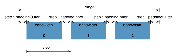
These are the methods available:
- .domain()
- .range()
- .rangeRound()
- .round()
- .paddingInner()
- .paddingOuter()
- .padding()
- .align()
- .bandwidth()
- .step()
Following the same CSV with this data:
year     population
1950        5
1951        10
1955        15
1959        20
d3.scaleBand().domain()
The xScale is used to scale the year column. Instead of using it as a Date, it maps the range of the dataset length to a width range.:
xScale = d3.scaleBand()
           .domain(d3.range(dataset.length))
The domain .domain(d3.range(dataset.length)) is a range of dataset.length:
d3.range(dataset.length)
You can use the console.log() inside the CSV function to test:
d3.csv("file.csv", rowConverter).then(function(dataset) {
    console.log(dataset.length);
    console.log(d3.range(dataset.length));
    ...
The console should output this:
4
Array(4) [ 0, 1, 2, 3 ]
The domain for scaleBand() is using this:
.domain([0, 1, 2, 3])
d3.scaleBand().range()
Setting the range to fit within the width of the SVG:
xScale = d3.scaleBand()
           .domain(d3.range(dataset.length))
           .range([0, w]);
The range calculates even bars using this formula (w - 0) / .domain().length. In our case that is 500/4 = 125.
d3.scaleBand().paddingInner()
As explained in the API docs. It says that if you don’t specify a paddingInner, the default is zero 0. If you specify one, the number must be <= 1. A value of 0 means there is no blank space between the bars. A value of 1 means a bandwidth of 0.
xScale = d3.scaleBand()
           .domain(d3.range(dataset.length))
           .range([0, w])
           .paddingInner(0.1);
d3.scaleBand().paddingOuter()
This is the padding to apply before the first bar and after the last bar. The number is in the range of [0, 1]. If not specified, the padding returns zero.
xScale = d3.scaleBand()
           .domain(d3.range(dataset.length))
           .range([0, w])
           .paddingInner(0.1)
           .paddingOuter(0.1);
d3.scaleBand().rangeRound()
The range can calculate long decimal numbers such as this:
<svg width="500" height="300">
    <rect x="12.195121951219477" y="205" width="122" height="55" fill="teal"></rect>
    <rect x="134.14634146341461" y="150" width="122" height="110" fill="teal"></rect>
    <rect x="256.0975609756098" y="95" width="122" height="165" fill="teal"></rect>
    <rect x="378.04878048780483" y="40" width="122" height="220" fill="teal"></rect>
</svg>
We can replace range with rangeRound.
xScale = d3.scaleBand()
           .domain(d3.range(dataset.length))
           .rangeRound([padding, w])
           .paddingInner(0.1)
           .paddingOuter(0.1);
The HTML now shows something like this:
<svg width="500" height="300">
    <rect x="14" y="205" width="122" height="55" fill="teal"></rect>
    <rect x="135" y="150" width="122" height="110" fill="teal"></rect>
    <rect x="256" y="95" width="122" height="165" fill="teal"></rect>
    <rect x="377" y="40" width="122" height="220" fill="teal"></rect>
</svg>
d3.scaleBand().bandwidth()
This is used later to return the width of each bar.
Applying scales scaleBand() and scaleLinear()
We need to update the code and add the scale functions:
var w = 500;
var h = 300;
var barPadding = 3;
var padding = 40;
var svg = d3.select("body")
            .append("svg")
            .attr("width", w)
            .attr("height", h);

var parseTime = d3.timeParse("%Y");

var rowConverter = function(d) {
    return {
        year: parseTime(d.year),
        population: +d.population
    }
}

d3.csv("file.csv", rowConverter).then(function(dataset) {

    xScale = d3.scaleBand()
               .domain(d3.range(dataset.length))
               .rangeRound([padding, w])
               .paddingInner(0.1)
               .paddingOuter(0.1);

    yScale = d3.scaleLinear()
               .domain([0, d3.max(dataset, function(d) { return d.population; })])
               .range([h - padding, padding]);

    svg.selectAll("rect")
       .data(dataset)
       .enter()
       .append("rect")
       .attr("x", function(d, i) {
           return xScale(i);
       })
       .attr("y", function(d) {
           return yScale(d.population);
       })
       .attr("width", xScale.bandwidth())
       .attr("height", function(d) {
           return h - padding - yScale(d.population);
       })
       .attr("fill", "teal");
});
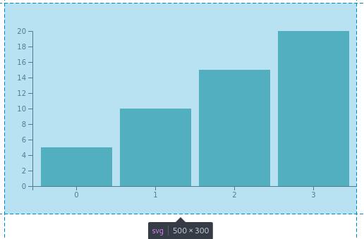
The result is this bar chart:
(This is an image)
The HTML is this:
<svg width="500" height="300">
    <rect x="52" y="205" width="101" height="55" fill="teal"></rect>
    <rect x="164" y="150" width="101" height="110" fill="teal"></rect>
    <rect x="276" y="95" width="101" height="165" fill="teal"></rect>
    <rect x="388" y="40" width="101" height="220" fill="teal"></rect>
</svg>
Not exactly sure how the width was calculated to 101. I know that the rangeRound([padding, w]) calculates each bar width to (w-40)/domain().length equivalent to (500 - 40) / 4 = 115. Using the inner and outer padding, somehow this is reduced to 101.
You can use console.log() to test the output such as in here:
svg.selectAll("rect")
   .data(dataset)
   .enter()
   .append("rect")
   .attr("x", function(d, i) {

       console.log("x");
       console.log(d);
       console.log(xScale.domain());
       console.log(xScale.range());
       console.log(xScale.paddingInner());
       console.log(xScale.paddingOuter());
       console.log(xScale.bandwidth());
       console.log(xScale(i));

       return xScale(i);
   })
Barchart Visualization
This how the bar chart looks like:
(This is a D3 vis)
D3 Responsive Visualization on index.html and project.js
Continuing adding responsive to the project.js, we need to make two changes:
The index.html now says this. I added <div id="d3-barchart-vis"></div>:
<!DOCTYPE html>
<html lang="en">
    <head>
        <meta charset="utf-8">
        <title>D3 Canvas</title>
        <link rel="icon" type="image/png" href="icon.png">
        <script type="text/javascript" src="assets/js/d3.min.js"></script>
        <link rel="stylesheet" type="text/css" href="main.css">
    </head>
    <body>
        <div id="d3-barchart-vis"></div>
        <script type="text/javascript" src="project.js"></script>
    </body>
</html>
The project.js needs to be modified when creating the svg. It selects div id="d3-barchart-vis". It uses preserveAspectRatio and viewBox for responsive. The viewBox follows this syntax "min-x min-y width height". I concatenated the numbers and the spaces:
var svg = d3.select("#d3-barchart-vis")
            .append("svg")
            .attr("preserveAspectRatio", "xMinYMin meet")
            .attr("viewBox", "0 0 " + w + " " + h);
The code for project.js looks like this:
var w = 500;
var h = 300;
var barPadding = 3;
var padding = 40;
var svg = d3.select("#d3-barchart-vis")
            .append("svg")
            .attr("preserveAspectRatio", "xMinYMin meet")
            .attr("viewBox", "0 0 " + w + " " + h);

var parseTime = d3.timeParse("%Y");

var rowConverter = function(d) {
    return {
        year: parseTime(d.year),
        population: +d.population
    }
}

d3.csv("file.csv", rowConverter).then(function(dataset) {

    xScale = d3.scaleBand()
               .domain(d3.range(dataset.length))
               .rangeRound([padding, w])
               .paddingInner(0.1)
               .paddingOuter(0.1);

    yScale = d3.scaleLinear()
               .domain([0, d3.max(dataset, function(d) { return d.population; })])
               .range([h - padding, padding]);

    svg.selectAll("rect")
       .data(dataset)
       .enter()
       .append("rect")
       .attr("x", function(d, i) {
           return xScale(i);
       })
       .attr("y", function(d) {
           return yScale(d.population);
       })
       .attr("width", xScale.bandwidth())
       .attr("height", function(d) {
           return h - padding - yScale(d.population);
       })
       .attr("fill", "teal");
});
Using Arrow Functions
More about arrow functions on Mozilla.
Given this example:
elements.map(function(element) {
    return element.length;
});
This can be simplified to:
elements.map((element) => {
    return element.length;
});
If there is only one parameter and the only statement is return then it can be simplified to this:
elements.map(element => element.length);
Refactoring svg.selectAll("rect")
var w = 500;
var h = 300;
var barPadding = 3;
var padding = 40;
var svg = d3.select("#d3-barchart-vis")
            .append("svg")
            .attr("preserveAspectRatio", "xMinYMin meet")
            .attr("viewBox", "0 0 " + w + " " + h);

var parseTime = d3.timeParse("%Y");

var rowConverter = function(d) {
    return {
        year: parseTime(d.year),
        population: +d.population
    }
}

d3.csv("file.csv", rowConverter).then(function(dataset) {

    xScale = d3.scaleBand()
               .domain(d3.range(dataset.length))
               .rangeRound([padding, w])
               .paddingInner(0.1)
               .paddingOuter(0.1);

    yScale = d3.scaleLinear()
               .domain([0, d3.max(dataset, function(d) { return d.population; })])
               .range([h - padding, padding]);

    svg.selectAll("rect")
       .data(dataset)
       .enter()
       .append("rect")
       .attr("x", function(d, i) {
           return xScale(i);
       })
       .attr("y", d => yScale(d.population))
       .attr("width", xScale.bandwidth())
       .attr("height", d => h - padding - yScale(d.population))
       .attr("fill", "teal");
});
Adding Axes to our Bar Chart
Use any of these: d3.axisTop, d3.axisBottom, d3.axisLeft, d3.axisRight. Then append a g (group) element to the end of the SVG.
var xAxis = d3.axisBottom(xScale);
var yAxis = d3.axisLeft(yScale);
Put this at the end of the script, since the graphics lay on top of each other, making the axes the last visible graph at the top of the SVG.
svg.append("g")
   .attr("class", "axis")
   .attr("transform", "translate(0," + (h - padding) + ")")
   .call(xAxis);

svg.append("g")
   .attr("class", "axis")
   .attr("transform", "translate(" + padding + ",0)")
   .call(yAxis);
This line is a string concatenation:
.attr("transform", "translate(0," + (h - padding) + ")")
It computes to the following:
.attr("transform", "translate(0", + (300 - 40 ) + ")")
Then the result is:
svg.append("g")
   .attr("class", "axis")
   .attr("transform", "translate(0,260)")
   .call(xAxis);
The translate function moves the object by x and y. More details in the MDN Web Docs.
The bar chart should now look like this:
(This is an image)
The complete code with x and y axes:
var w = 500;
var h = 300;
var barPadding = 3;
var padding = 40;
var svg = d3.select("#d3-barchart-vis")
            .append("svg")
            .attr("preserveAspectRatio", "xMinYMin meet")
            .attr("viewBox", "0 0 " + w + " " + h);

var parseTime = d3.timeParse("%Y");

var rowConverter = function(d) {
    return {
        year: parseTime(d.year),
        population: +d.population
    }
}

d3.csv("file.csv", rowConverter).then(function(dataset) {

    xScale = d3.scaleBand()
               .domain(d3.range(dataset.length))
               .rangeRound([padding, w])
               .paddingInner(0.1)
               .paddingOuter(0.1);

    yScale = d3.scaleLinear()
               .domain([0, d3.max(dataset, function(d) { return d.population; })])
               .range([h - padding, padding]);

    var xAxis = d3.axisBottom(xScale);
    var yAxis = d3.axisLeft(yScale);

    svg.selectAll("rect")
       .data(dataset)
       .enter()
       .append("rect")
       .attr("x", function(d, i) {
           return xScale(i);
       })
       .attr("y", d => yScale(d.population))
       .attr("width", xScale.bandwidth())
       .attr("height", d => h - padding - yScale(d.population))
       .attr("fill", "teal");

    svg.append("g")
       .attr("class", "x axis")
       .attr("transform", "translate(0," + (h - padding) + ")")
       .call(xAxis);

    svg.append("g")
       .attr("class", "y axis")
       .attr("transform", "translate(" + padding + ",0)")
       .call(yAxis);
});
Adding ticks on the Axes
Use .ticks(). However, D3 will override this if it wants to divide the input domain evenly.
Use .tickValues([an array of values]) to set them manually.
Use .tickFormat to format the axis labels.
var xAxis = d3.axisBottom(xScale)
              .ticks(someParameterHere);
For now I will not use this.
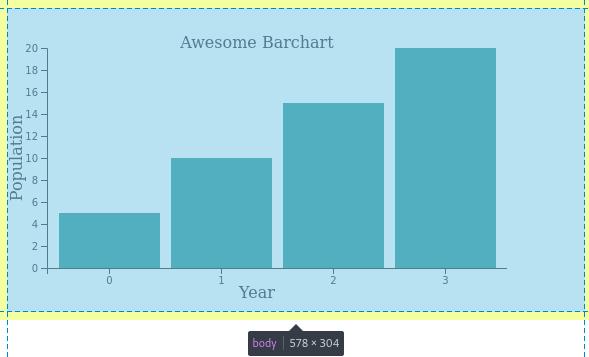
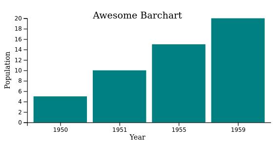
Adding a Title to the Graph
Use append("text") to append a title to the graph:
svg.append("text")
   .attr("x", w/2)
   .attr("y", padding)
   .attr("text-anchor", "middle")
   .style("font-size", "16px")
   .text("Awesome Barchart");
Add a label for the x Axis
A label can be added to the x Axis by appending a text and using the transform and translate to position the text.
The function translate uses a string concatenation to get to translate(w/2, h-10) which is calculated to translate(500/2, 300-10) or translate(250, 290). Where x is in the middle of the SVG and y is 10px from the bottom (or 290px from the top).
svg.append("text")
   .attr("transform", "translate(" + (w/2) + " ," + (h-10) + ")")
   .style("text-anchor", "middle")
   .text("Year");
Add a label for the y Axis
The label for the y Axis is a bit different. First we need to rotate the label vertically with a negative -90 degrees. Then the point of reference for (0,0) changes. If I am not mistaken it’s now on the top right relative to the rotated text.
To center the text vertically. Move it half way to the left at an x distance of -(h/2). The y is set relative to the rotated position. If you move it down (to the right) it will be a positive number (towards the y Axis). If you move it up (to the left) it will be a negative number (away from the y Axis).
svg.append("text")
   .attr("transform", "rotate(-90)")
   .attr("x", -(h/2))
   .attr("y", 15)
   .style("text-anchor", "middle")
   .text("Population");
The barchart looks like this:
(This is an image)
The code with the labels is now this:
var w = 500;
var h = 300;
var barPadding = 3;
var padding = 40;
var svg = d3.select("#d3-barchart-vis")
            .append("svg")
            .attr("preserveAspectRatio", "xMinYMin meet")
            .attr("viewBox", "0 0 " + w + " " + h);

var parseTime = d3.timeParse("%Y");

var rowConverter = function(d) {
    return {
        year: parseTime(d.year),
        population: +d.population
    }
}

d3.csv("file.csv", rowConverter).then(function(dataset) {

    xScale = d3.scaleBand()
               .domain(d3.range(dataset.length))
               .rangeRound([padding, w])
               .paddingInner(0.1)
               .paddingOuter(0.1);

    yScale = d3.scaleLinear()
               .domain([0, d3.max(dataset, function(d) { return d.population; })])
               .range([h - padding, padding]);

    var xAxis = d3.axisBottom(xScale);
    var yAxis = d3.axisLeft(yScale);

    svg.selectAll("rect")
       .data(dataset)
       .enter()
       .append("rect")
       .attr("x", function(d, i) {
           return xScale(i);
       })
       .attr("y", d => yScale(d.population))
       .attr("width", xScale.bandwidth())
       .attr("height", d => h - padding - yScale(d.population))
       .attr("fill", "teal");

    // Add the x Axis
    svg.append("g")
       .attr("class", "x axis")
       .attr("transform", "translate(0," + (h - padding) + ")")
       .call(xAxis);

    // Label for x Axis
    svg.append("text")
       .attr("transform", "translate(" + (w/2) + " ," + (h-10) + ")")
       .style("text-anchor", "middle")
       .text("Year");

    // Add the y Axis
    svg.append("g")
       .attr("class", "y axis")
       .attr("transform", "translate(" + padding + ",0)")
       .call(yAxis);

    // Label for y Axis
    svg.append("text")
       .attr("transform", "rotate(-90)")
       .attr("x", -(h/2))
       .attr("y", 15)
       .style("text-anchor", "middle")
       .text("Population");

    svg.append("text")
       .attr("x", w/2)
       .attr("y", padding)
       .attr("text-anchor", "middle")
       .style("font-size", "16px")
       .text("Awesome Barchart");
});
Adding Margins
The label for the y Axis is too close to the left. I had to plug a few different numbers in .attr("y", 15) to make it fit.
// Label for y Axis
svg.append("text")
   .attr("transform", "rotate(-90)")
   .attr("x", -(h/2))
   .attr("y", 15)
   .style("text-anchor", "middle")
   .text("Population");
We can add the margins like this:
var margin = {top: 20, right: 20, bottom: 20, left: 20},
    w = 500 - margin.left - margin.right,
    h = 300 - margin.top - margin.bottom;
Perhaps the labels are too big. They are the same size as the title. I added a font size for the labels, changed the position of the y label, and added the margins.
The barchart looks like this:
(This is an image)
The code with the margins is now this:
var margin = {top: 20, right: 20, bottom: 20, left: 20},
        w = 500 - margin.left - margin.right,
        h = 300 - margin.top - margin.bottom;

var barPadding = 3;
var padding = 40;
var svg = d3.select("#d3-barchart-vis")
            .append("svg")
            .attr("preserveAspectRatio", "xMinYMin meet")
            .attr("viewBox", "0 0 " + w + " " + h);

var parseTime = d3.timeParse("%Y");

var rowConverter = function(d) {
    return {
        year: parseTime(d.year),
        population: +d.population
    }
}

d3.csv("file.csv", rowConverter).then(function(dataset) {

    xScale = d3.scaleBand()
               .domain(d3.range(dataset.length))
               .rangeRound([padding, w])
               .paddingInner(0.1)
               .paddingOuter(0.1);

    yScale = d3.scaleLinear()
               .domain([0, d3.max(dataset, function(d) { return d.population; })])
               .range([h - padding, padding]);

    var xAxis = d3.axisBottom(xScale);
    var yAxis = d3.axisLeft(yScale);

    svg.selectAll("rect")
       .data(dataset)
       .enter()
       .append("rect")
       .attr("x", function(d, i) {
           return xScale(i);
       })
       .attr("y", d => yScale(d.population))
       .attr("width", xScale.bandwidth())
       .attr("height", d => h - padding - yScale(d.population))
       .attr("fill", "teal");

    // Add the x Axis
    svg.append("g")
       .attr("class", "x axis")
       .attr("transform", "translate(0," + (h - padding) + ")")
       .call(xAxis);

    // Label for x Axis
    svg.append("text")
       .attr("transform", "translate(" + (w/2) + " ," + (h-10) + ")")
       .style("text-anchor", "middle")
       .style("font-size", "12px")
       .text("Year");

    // Add the y Axis
    svg.append("g")
       .attr("class", "y axis")
       .attr("transform", "translate(" + padding + ",0)")
       .call(yAxis);

    // Label for y Axis
    svg.append("text")
       .attr("transform", "rotate(-90)")
       .attr("x", -(h/2))
       .attr("y", 10)
       .style("text-anchor", "middle")
       .style("font-size", "12px")
       .text("Population");

    svg.append("text")
       .attr("x", w/2)
       .attr("y", padding)
       .attr("text-anchor", "middle")
       .style("font-size", "16px")
       .text("Awesome Barchart");
});
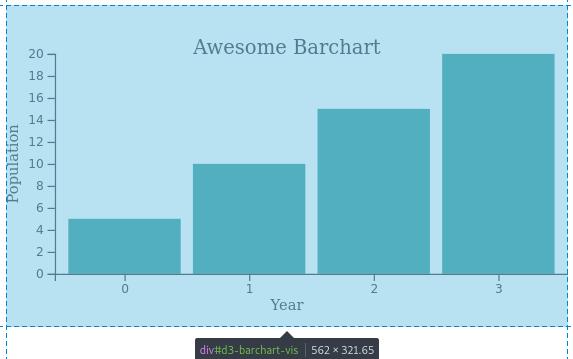
Troubleshooting the Year on the x Axis
The barchart still doesn’t look correct. The ticks on the x Axis are supposed to be years and not integers starting at 1.
(This is an image)
I need to modify the scaleBand() so the domain maps to the years on the converted Date objects from the CSV file.
It currently looks like this:
xScale = d3.scaleBand()
           .domain(d3.range(dataset.length))
           .rangeRound([padding, w])
           .paddingInner(0.1)
           .paddingOuter(0.1);
I changed it to this:
xScale = d3.scaleBand()
           .domain(dataset.map(d => d.year.getFullYear()))
           .rangeRound([padding, w])
           .paddingInner(0.1)
           .paddingOuter(0.1);
You can test what this does on the console dataset.map(d => d.year.getFullYear()) inside this section:
d3.csv("file.csv", rowConverter).then(function(dataset) {
    console.log(dataset.map(d => d.year.getFullYear()))
The output should be:
Array(4) [ 1950, 1951, 1955, 1959 ]
Then modify implementing the xScale in this section. From this return xScale(i):
svg.selectAll("rect")
   .data(dataset)
   .enter()
   .append("rect")
   .attr("x", function(d, i) {
       return xScale(i);
   })
   .attr("y", d => yScale(d.population))
   .attr("width", xScale.bandwidth())
   .attr("height", d => h - padding - yScale(d.population))
   .attr("fill", "teal");
Modified to this return xScale(d.year.getFullYear()):
svg.selectAll("rect")
   .data(dataset)
   .enter()
   .append("rect")
   .attr("x", function(d, i) {
       return xScale(d.year.getFullYear());
   })
   .attr("y", d => yScale(d.population))
   .attr("width", xScale.bandwidth())
   .attr("height", d => h - padding - yScale(d.population))
   .attr("fill", "teal");
The corrected barchart looks like this:
(This is an image)
The code with a bit more arrow functions:
var margin = {top: 20, right: 20, bottom: 20, left: 20},
        w = 500 - margin.left - margin.right,
        h = 300 - margin.top - margin.bottom;

var barPadding = 3;
var padding = 40;
var svg = d3.select("#d3-barchart-vis")
            .append("svg")
            .attr("preserveAspectRatio", "xMinYMin meet")
            .attr("viewBox", "0 0 " + w + " " + h);

var parseTime = d3.timeParse("%Y");

var rowConverter = function(d) {
    return {
        year: parseTime(d.year),
        population: +d.population
    }
}

d3.csv("file.csv", rowConverter).then(function(dataset) {

    xScale = d3.scaleBand()
               .domain(dataset.map(d => d.year.getFullYear()))
               .rangeRound([padding, w])
               .paddingInner(0.1)
               .paddingOuter(0.1);

    yScale = d3.scaleLinear()
               .domain([0, d3.max(dataset, d => d.population)])
               .range([h - padding, padding]);

    var xAxis = d3.axisBottom(xScale);
    var yAxis = d3.axisLeft(yScale);

    svg.selectAll("rect")
       .data(dataset)
       .enter()
       .append("rect")
       .attr("x", d => xScale(d.year.getFullYear()))
       .attr("y", d => yScale(d.population))
       .attr("width", xScale.bandwidth())
       .attr("height", d => h - padding - yScale(d.population))
       .attr("fill", "teal");

    // Add the x Axis
    svg.append("g")
       .attr("class", "x axis")
       .attr("transform", "translate(0," + (h - padding) + ")")
       .call(xAxis);

    // Label for x Axis
    svg.append("text")
       .attr("transform", "translate(" + (w/2) + " ," + (h-10) + ")")
       .style("text-anchor", "middle")
       .style("font-size", "12px")
       .text("Year");

    // Add the y Axis
    svg.append("g")
       .attr("class", "y axis")
       .attr("transform", "translate(" + padding + ",0)")
       .call(yAxis);

    // Label for y Axis
    svg.append("text")
       .attr("transform", "rotate(-90)")
       .attr("x", -(h/2))
       .attr("y", 10)
       .style("text-anchor", "middle")
       .style("font-size", "12px")
       .text("Population");

    svg.append("text")
       .attr("x", w/2)
       .attr("y", padding)
       .attr("text-anchor", "middle")
       .style("font-size", "16px")
       .text("Awesome Barchart");
});
D3 Mouse Event Handler
I want the barchart to change colors when you mouse over a bin to highlight what you are pointing at.
Add two functions here:
svg.selectAll("rect")
   .data(dataset)
   .enter()
   .append("rect")
   .attr("x", d => xScale(d.year.getFullYear()))
   .attr("y", d => yScale(d.population))
   .attr("width", xScale.bandwidth())
   .attr("height", d => h - padding - yScale(d.population))
   .attr("fill", "teal")
   .on("mouseover", handleMouseOver)
   .on("mouseout", handleMouseOut);
Then add the functions to process each interaction at the end, before the closing of d3.csv:
function handleMouseOver(d, i) {
    d3.select(this)
      .attr("fill", "red");
}

function handleMouseOut(d, i) {
    d3.select(this)
      .attr("fill", "teal");
}
The barchart with mouse event handler looks like this:
(This is a D3 vis)
The final code is this:
var margin = {top: 20, right: 20, bottom: 20, left: 20},
        w = 500 - margin.left - margin.right,
        h = 300 - margin.top - margin.bottom;

var barPadding = 3;
var padding = 40;
var svg = d3.select("#d3-barchart-vis")
            .append("svg")
            .attr("preserveAspectRatio", "xMinYMin meet")
            .attr("viewBox", "0 0 " + w + " " + h);

var parseTime = d3.timeParse("%Y");

var rowConverter = function(d) {
    return {
        year: parseTime(d.year),
        population: +d.population
    }
}

d3.csv("file.csv", rowConverter).then(function(dataset) {

    xScale = d3.scaleBand()
               .domain(dataset.map(d => d.year.getFullYear()))
               .rangeRound([padding, w])
               .paddingInner(0.1)
               .paddingOuter(0.1);

    yScale = d3.scaleLinear()
               .domain([0, d3.max(dataset, d => d.population)])
               .range([h - padding, padding]);

    var xAxis = d3.axisBottom(xScale);
    var yAxis = d3.axisLeft(yScale);

    svg.selectAll("rect")
       .data(dataset)
       .enter()
       .append("rect")
       .attr("x", d => xScale(d.year.getFullYear()))
       .attr("y", d => yScale(d.population))
       .attr("width", xScale.bandwidth())
       .attr("height", d => h - padding - yScale(d.population))
       .attr("fill", "teal")
       .on("mouseover", handleMouseOver)
       .on("mouseout", handleMouseOut);

    // Add the x Axis
    svg.append("g")
       .attr("class", "x axis")
       .attr("transform", "translate(0," + (h - padding) + ")")
       .call(xAxis);

    // Label for x Axis
    svg.append("text")
       .attr("transform", "translate(" + (w/2) + " ," + (h-10) + ")")
       .style("text-anchor", "middle")
       .style("font-size", "12px")
       .text("Year");

    // Add the y Axis
    svg.append("g")
       .attr("class", "y axis")
       .attr("transform", "translate(" + padding + ",0)")
       .call(yAxis);

    // Label for y Axis
    svg.append("text")
       .attr("transform", "rotate(-90)")
       .attr("x", -(h/2))
       .attr("y", 10)
       .style("text-anchor", "middle")
       .style("font-size", "12px")
       .text("Population");

    svg.append("text")
       .attr("x", w/2)
       .attr("y", padding)
       .attr("text-anchor", "middle")
       .style("font-size", "16px")
       .text("Awesome Barchart");

    function handleMouseOver(d, i) {
        d3.select(this)
          .attr("fill", "red");
    }

    function handleMouseOut(d, i) {
        d3.select(this)
          .attr("fill", "teal");
    }
});
Embedding D3 Visualization on a blog post
You can also add a D3 visualization to a blog post. My blog follows this directory structure:
assets/
  csv/
    file.csv
  js/
    d3.min.js
    d3-barchart-vis.js
_posts/
  this-blog-post.md
Add a div with a descriptive id to the section of your blog post where you want to add your visualization:
<div id="d3-barchart-vis"></div>
In the d3-barchart-vis.js, the svg selects this <div id:
var svg = d3.select("#d3-barchart-vis")
            .append("svg")
            .attr("preserveAspectRatio", "xMinYMin meet")
            .attr("viewBox", "0 0 " + w + " " + h);
The csv file is called like this so it points at the correct directory:
d3.csv("../assets/csv/file.csv", rowConverter).then(function(dataset) {
At the end of the blog post, after all content, add a reference to the JavaScript files:
<script type="text/javascript" src="../assets/js/d3.min.js"></script>
<script type="text/javascript" src="../assets/js/d3-barchart-vis.js"></script>