The Best Time To Run According To Science
What is the best time to run? According to science it depends on the ozone levels where you live.
(I published this story last year in another website. I updated some code and plots)
The best time to run in San Francisco is at 6am.
The best time to run in Miami is at 6am or 7am but not at noon.
I studied ozone levels from a data set that showed hourly measurements of ozone levels for different cities in the US for 2016.
Ozone who?
Wikipedia says that ozone is a pale blue gas with a bad smell.
- Ozone odour is sharp, smells like chlorine and is measured in parts per billion (ppb).
- Concentrations of 100ppb and above damages respiratory tissues. Which makes ozone a respiratory hazard near ground level.
You might also know ozone as in “ozone layer”. Which is a portion of the stratosphere. About 20 miles above the ground.
Just to give you a better reference. Perhaps you remember the pilot saying “We are at 35,000 feet now you can watch a movie and eat peanuts”. The ozone layer is at about 100,000 feet.
The ozone layer prevents UV light from reaching the surface. Which is actually good. But ozone at surface level. Not good.
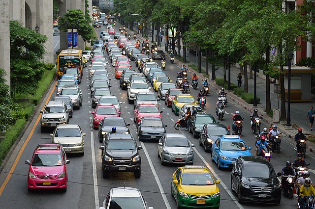
Bad ozone is due to…drum roll…fossil fuel burning.
Example of fossil fuel burning
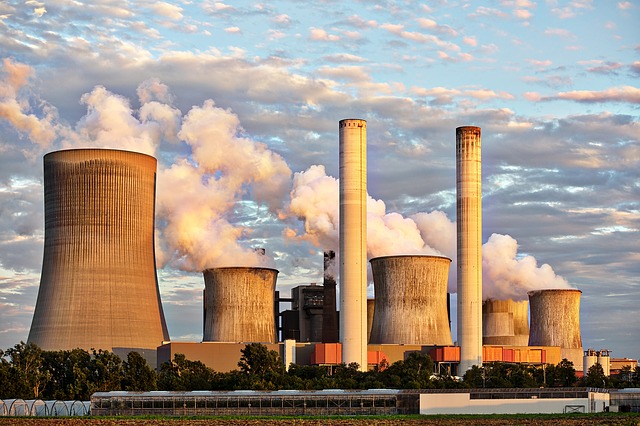
Factories burning fossil fuel
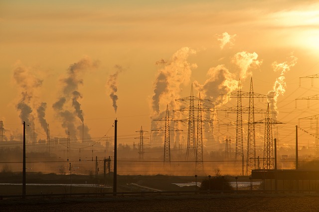
Cars in traffic burning fossil fuel
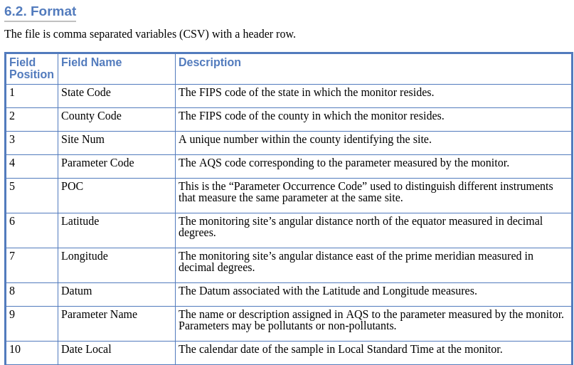
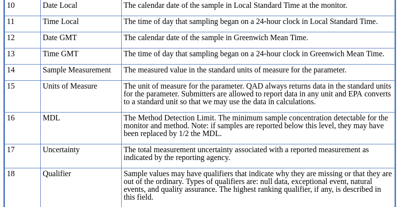
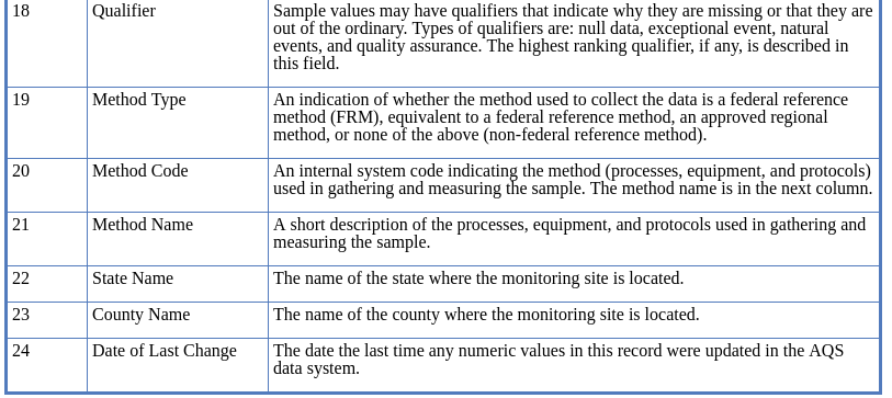
Data About Ozone Levels
Now that you know how bad ozone is created let’s look at some data.
The Environmental Protection Agency (EPA) website has data sets about ozone levels in the US since 1980.
I downloaded 2 data sets:
Hourly ozone levels in the US from 2016. The zip file was 69MB. Uncompressed, the csv file is 2.1GB.
The other data set was daily AQI by county from 2016. The zip file was 1.6MB and the csv file was 26.4MB.
AQI stands for Air Quality Index. A measure developed by EPA to explain pollution levels to the general public.
I used Rstudio to open and analyze the data. Rstudio is an open source software for R, a programming language for statistical computing.
Loading the data into Rstudio
This process comes from the Coursera class “Managing Data Analysis”.
Setup the project:
- File New Project
- New Directory
- Empty Project
- Enter name and browse to subdirectory
Install readr
If you don’t have the package readr you need to install it. It will take about 5 minutes:
> install.packages("readr")
The library readr is needed to read rectangular data such as csv.
Then load the library:
> library(readr)
Load the CSV file with read_csv
Load the CSV file and create an object. The function read_csv converts the csv file into a data frame. If you don’t specify the types for columns, strange things happen.
For example the data set has a column called Time.Local, which by default is of type integer. If you run a plot using Time.Local you will get the time in seconds instead of hours, such as:
3600, representing 1am
7200, representing 2am
and so on...
The column type has to be set to c character so that Time.Local can take values like this:
00:00
01:00
02:00
and so on...
Setting the column types depend on the columns.
But how do you set them up if you haven’t loaded the data?
The data source should have a description of the data. In this case there is more information about this data set on the EPA website.
Here is the line to load the CSV into the object ozone.
> ozone <- read_csv("ozone_data_2016.csv",
col_types = "ccccinnccccccncnnccccccc")
Get the names of the columns
If you call this function: names(ozone) you get this result:
> names(ozone)
 [1] "State Code"      "County Code"         "Site Num"
 [4] "Parameter Code"  "POC"                 "Latitude"
 [7] "Longitude"       "Datum"               "Parameter Name"
[10] "Date Local"      "Time Local"          "Date GMT"
[13] "Time GMT"        "Sample Measurement"  "Units of Measure"
[16] "MDL"             "Uncertainty"         "Qualifier"
[19] "Method Type"     "Method Code"         "Method Name"
[22] "State Name"      "County Name"         "Date of Last Change"
By definition names is used to get or set the name of an object.
If the object is a dataframe it gets the names of the columns.
Normalize the column names
If you call this function: make.names(names(ozone)) you get this result:
> make.names(names(ozone))
 [1] "State.Code"      "County.Code"         "Site.Num"
 [4] "Parameter.Code"  "POC"                 "Latitude"
 [7] "Longitude"       "Datum"               "Parameter.Name"
[10] "Date.Local"      "Time.Local"          "Date.GMT"
[13] "Time.GMT"        "Sample.Measurement"  "Units.of.Measure"
[16] "MDL"             "Uncertainty"         "Qualifier"
[19] "Method.Type"     "Method.Code"         "Method.Name"
[22] "State.Name"      "County.Name"         "Date.of.Last.Change"
By definition make.names is used to make syntactically valid names out of character vectors. The help page explains that syntactically valid names consist of letters, numbers and dot or underline and start with a letter or the dot but not followed by a number. For instance .2file is not a valid name.
I am thinking that one of the reasons for this conversion is the problem of spaces in character strings. For instance, when using files and directories in Linux. You need to escape the space with \ . Otherwise you should not use spaces when naming files or directories.
To normalize the column names, and replace spaces with periods, use: make.names(names(ozone)).
Replace the names of columns
Finally, this is used to set this conversion back to the names object:
> names(ozone) <- make.names(names(ozone))
Now, when you call names(ozone) the spaces are replaced by dots.
> names(ozone)
 [1] "State.Code"      "County.Code"         "Site.Num"
 [4] "Parameter.Code"  "POC"                 "Latitude"
 [7] "Longitude"       "Datum"               "Parameter.Name"
[10] "Date.Local"      "Time.Local"          "Date.GMT"
[13] "Time.GMT"        "Sample.Measurement"  "Units.of.Measure"
[16] "MDL"             "Uncertainty"         "Qualifier"
[19] "Method.Type"     "Method.Code"         "Method.Name"
[22] "State.Name"      "County.Name"         "Date.of.Last.Change"
Reviewing the top and bottom
Check the number of rows:
> nrow(ozone)
[1] 9124268
Check the number of columns:
> ncol(ozone)
[1] 24
Then check the top of the file:
> head(ozone[, c(6:7, 10)])

# A tibble: 6 x 3
Latitude Longitude Date.Local
      <dbl>     <dbl> <chr>
1     30.5     -87.9 2016-03-01
2     30.5     -87.9 2016-03-01
3     30.5     -87.9 2016-03-01
4     30.5     -87.9 2016-03-01
5     30.5     -87.9 2016-03-01
6     30.5     -87.9 2016-03-01
Check the bottom of the file:
> tail(ozone[, c(6:7, 10)])

# A tibble: 6 x 3
Latitude Longitude Date.Local
    <dbl>     <dbl> <chr>
1     18.2     -65.9 2016-12-31
2     18.2     -65.9 2016-12-31
3     18.2     -65.9 2016-12-31
4     18.2     -65.9 2016-12-31
5     18.2     -65.9 2016-12-31
6     18.2     -65.9 2016-12-31
Check the number of records for each hour
Using the table function. This function “uses the cross classifying factors to build a contingency table of counts at each combination of factor levels”.
In this case I know that the ozone levels are measured every hour from midnight to noon to 11pm. I would like to know the number of records for each hour.
table(ozone$Time.Local)
This results in:
00:00  01:00  02:00  03:00  04:00  05:00  06:00  07:00  08:00
369489 373144 359722 358576 363421 385829 386222 384176 381303
09:00  10:00  11:00  12:00  13:00  14:00  15:00  16:00
379689 379424 380814 381202 383439 385152 386580 387565
17:00  18:00  19:00  20:00  21:00  22:00  23:00
388252 388576 388656 388650 387492 377278 379617
What does this data mean?
I selected and filtered parts of the data to understand more about it.
Was the data grouped by state? Or was the data grouped by hour?
I learned that there are monitors all around the US that can measure ozone levels.
Install dplyr
The next step requires to use the library dplyr. Which is the next iteration of plyr, a set of tools for splitting, applying and combining data. dplyr “provides a flexible grammar of data manipulation…focused on tools for working with data frames”.
> install.packages("dplyr")
This might ask to restart the R session before installing. Then try again. Now load the library.
> library(dplyr)
US States in the data set
I wanted to see which states were included in the data set I loaded.
> select(ozone, State.Name) %>% unique

# A tibble: 52 x 1
State.Name
   <chr>
 1 Alabama
 2 Alaska
 3 Arizona
 4 Arkansas
 5 California
 6 Colorado
 7 Connecticut
 8 Delaware
 9 District Of Columbia
10 Florida
# ... with 42 more rows
Ozone levels in Florida
I filtered the data set to see the ozone levels in Florida on July 9, 2016 at 6am for all counties
> filter(ozone, State.Name == "Florida",
Date.Local == "2016-07-09",
Time.Local == "06:00") %>% select(County.Name,
    Sample.Measurement)
The result was:
# A tibble: 58 x 2
   County.Name Sample.Measurement
         <chr>              <dbl>
 1     Alachua              0.002
 2       Baker              0.001
 3         Bay              0.017
 4     Brevard              0.014
 5     Brevard              0.016
 6     Broward              0.005
 7     Broward              0.004
 8     Broward              0.004
 9     Broward              0.008
10     Collier              0.004
# ... with 48 more rows
Convert PPM (parts per million) to PPM (per billion)
The sample measurement has units of ppm (parts per million).
To convert to ppb (parts per billion) you just move the dot three times to the right.
For instance, the first row that says 0.002 ppm converts to 2 ppb.
I learned that the EPA has an AQI calculator to convert from ppb to AQI (air quality index).
In the AQI calculator you have a few choices as shown here:
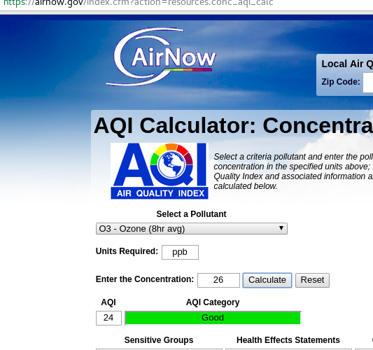
- Select a pollutant: O3 - Ozone (8hr avg) or (1hr avg)
- Units required: ppb
- Enter the concentration
- Calculate
The way to choose between 8hr and 1hr is:
AQI values of 301 or greater are calculated with 1-hr ozone concentrations.
AQI Categories
The EPA has a great website to learn more about the Air Quality Index (AQI).
The AQI is categorized like this:
- 0-50. Good. Green
- 51-100. Moderate. Yellow
- 101-150. Unhealthy for sensitive groups. Orange
- 151-200. Unhealthy. Red
- 201-300. Very unhealthy. Purple
- 301-500. Hazardous. Maroon.
This information was very helpful to understand the data
Very Unhealthy Jefferson county, Alabama
I filtered the data to find ozone measurements above 0.100 ppm (aka 100ppb). Which calculates to an AQI of 187 (Unhealthy).
> filter(ozone, Sample.Measurement > 0.1)
%>% select(State.Name, County.Name, Date.Local,
    Time.Local, Sample.Measurement)

# A tibble: 1,407 x 5
State.Name   County.Name Date.Local Time.Local Sample.Measurement
.    <chr>      <chr>     <date>     <time>         <dbl>
1    Alabama   Jefferson   2016-02-23   12:00:00   0.346
2    Alabama   Jefferson   2016-02-23   13:00:00   0.202
3    Alabama   Russell     2016-04-18   14:00:00   0.101
4    Alaska    Matanuska   2016-04-08   02:00:00   0.102
5    Arizona   Gila        2016-11-26   17:00:00   0.145
6    Arkansas  Crittenden  2016-06-10   13:00:00   0.107
7    Arkansas  Crittenden  2016-06-10   14:00:00   0.113
8    Arkansas  Crittenden  2016-06-10   15:00:00   0.104
9  California  Alameda     2016-06-03   15:00:00   0.102
10 California  Alameda     2016-07-26   15:00:00   0.102
# ... with 1,575 more rows
This shows that on February 23, 2016 at noon, there was a measurement of 346ppb in Jefferson county, Alabama.
Converted to AQI results in 276 aka “Very Unhealthy” and very close to “Hazardous”, which is described as “Health warnings of emergency conditions. The entire population is more likely to be affected.”
After a quick Google search I found that Jefferson county is amongst the top most polluted counties in the US. Yikes!
I read on Wikipedia that before Detroit. This county was the largest bankruptcy in the US with corruption being a big cause. Not sure if there is a correlation between corruption and air quality level.
It is worth exploring this data into more detail to find some correlation and try to answer a lot of interesting questions. Such as the correlation of corruption and air quality level.
For now let’s just look at hourly data from some cities to see when is the best time to run.
Plotting the best time to run
I know the names of some state counties in Florida. For example, for Miami, I know that the county is called “Miami Dade” but I wasn’t sure how they added this value into the data set. If they put “Dade” or “Miami” or what combination of Miami and Dade.
For each state I created vectors with the names of counties. I visualized the vectors into a table and then created a filter for the specific county.
Finally, I plotted Time vs Sample Measurement.
I suffered a little bit making these plots, as noted below.
Plotting Workflow
For example, look at the plotting workflow for Miami.
I created a vector with Florida counties:
> florida.counties <- filter(ozone,
    State.Name == "Florida") %>%
    select(County.Name) %>% unique
Then created a view:
> View(florida.counties)
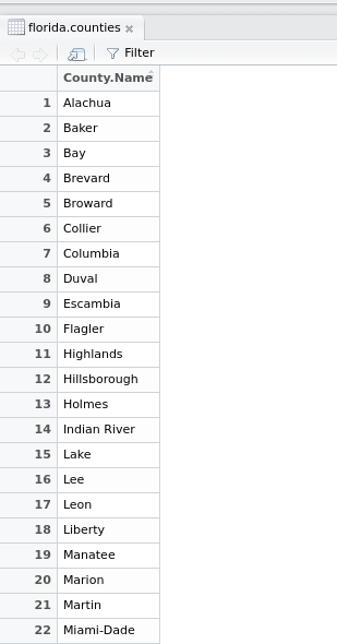
On the view I saw they had it as Miami-Dade.
> ozone.miami.2016 <- filter(ozone,
    County.Name == "Miami-Dade") %>%
    select(Date.Local, Time.Local,
        Sample.Measurement)
Troubleshooting drawing the Plot
I filtered by county name and then plotted Time.Local vs Sample.Measurement.
> plot(ozone.miami.2016$Time.Local,
    ozone.miami.2016$Sample.Measurement)
The output was an error:
Error in plot.window(...) : need finite
'xlim' values
In addition: Warning messages:
1: In xy.coords(x, y, xlabel, ylabel, log)
 : NAs introduced by coercion
2: In min(x) : no non-missing arguments
 to min; returning Inf
3: In max(x) : no non-missing arguments
 to max; returning -Inf
The error says that one of the coordinates is a vector with NAs.
I looked up the types for each variable:
> class(ozone.miami.2016$Time.Local)
[1] "character"
> class(ozone.miami.2016$Sample.Measurement)
[1] "numeric"
Time.Local is of type character and Sample.Measurement is of type numeric.
> head(ozone$Time.Local)
[1] "15:00" "16:00" "17:00" "18:00" "19:00" "20:00"

> head(ozone$Sample.Measurement)
[1] 0.041 0.041 0.042 0.041 0.038 0.038
You cannot plot character vs numeric.
To prove that Time.Local was a vector with NAs I used the function strptime.
The function strptime is used to convert between character representations and objects of classes “POSIXlt” and “POSIXct” representing calendar dates and times.
I read more about POSIXt and it seems to be a complicated topic as described here. I don’t want to get into much detail about this now.
The strptime function is used like this:
strptime(x, format, tz = "")

x: An object to be converted: a character vector
for strptime, an object which can be converted to
"POSIXlt" for strftime.

format: A character string. The default for
the format methods is "%Y-%m-%d %H:%M:%S".

tz: A character string specifying the
time zone to be used for the conversion
I ran the strptime function like this:
> strptime(ozone.miami.2016$Time.Local, '%H:%M:%S')
The result was something like this:
[1] NA NA NA NA NA NA NA
NA NA NA NA NA NA NA NA
NA NA NA NA NA NA NA NA
NA NA NA
As far as the error saying:
In xy.coords(x, y, xlabel, ylabel, log)
 : NAs introduced by coercion
I assume that plot is trying to make Time.Local which is a character element into numeric data. And when it fails to do this, it is returning NAs. (although I might be wrong about this).
Plotting Best Time to Run
Instead I thought that there is a way to plot Time.Local as a factor.
> plot(factor(ozone.miami.2016$Time.Local),
ozone.miami.2016$Sample.Measurement,
main = "Best Time to Run in Miami",
xlab = "Hour", ylab = "Ozone level in ppm")
Troubleshooting lower case and UPPER case variables
I also suffered a little bit with lower case and upper case variables.
To get the list of State.Name I did:
> unique(ozone$State.Name)
 [1] "Alabama"      "Alaska"     "Arizona"
 [4] "Arkansas"     "California" "Colorado"
 [7] "Connecticut"  "Delaware"   "District Of Columbia"
[10] "Florida"      "Georgia"
To get the County.Name for District of Columbia I did this but didn’t get any results:
> filter(ozone, State.Name == "District of Columbia") %>%
select(County.Name) %>% unique
# A tibble: 0 x 1
# ... with 1 variables: County.Name <chr>
I realized that I didn’t use the exact case. Instead of Of, I used of.
> filter(ozone, State.Name == "District Of Columbia")
 %>% select(County.Name) %>% unique
# A tibble: 1 x 1
           County.Name
                 <chr>
1 District of Columbia
I figured that normalizing the data is a pain in the butt.
I followed the same process to plot Miami, Washington DC, San Francisco and Los Angeles.
Summary how to Plot in R
Get a list of States:
unique(ozone$State.Name)
Find the County Name. This will give you a table of County names:
florida.counties <- filter(ozone, State.Name == "Florida")
%>% select(County.Name) %>% unique

View(florida.counties)
In this case I found the county for Miami Dade to be Miami-Dade.
Filter the data and create an object:
ozone.miami.2016 <- filter(ozone, County.Name == "Miami-Dade")
 %>% select(Date.Local, Time.Local, Sample.Measurement)
Create a plot with this object and add titles:
plot(factor(ozone.miami.2016$Time.Local),
ozone.miami.2016$Sample.Measurement, main =
"Best Time to Run in Miami", xlab = "Hour",
ylab = "Ozone level in ppm")
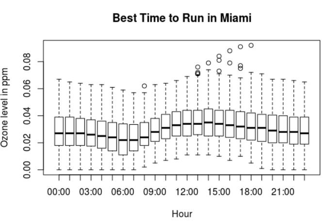
Best Time To Run in Miami
> summary(ozone.miami.2016$Sample.Measurement)
   Min. 1st Qu.  Median    Mean 3rd Qu.    Max.
0.00000 0.02000 0.02900 0.02985 0.04000 0.09200
Best time to run in Miami
Looking at the ozone levels in Miami:
- The lowest ozone levels in Miami are at 6am and 7am.
- The highest ozone levels in Miami are between 12pm and 5pm.
- At night the ozone levels are lower but not as low as in early morning.
The best time to run in Miami seems to be between 6am to 8am.
Best Time to Run in Washington DC
dc.counties <- filter(ozone, State.Name ==
    "District Of Columbia") %>% select(County.Name)
    %>% unique

View(dc.counties)

ozone.dc.2016 <- filter(ozone, County.Name ==
    "District of Columbia") %>% select(Date.Local,
        Time.Local, Sample.Measurement)

plot(factor(ozone.dc.2016$Time.Local),
 ozone.dc.2016$Sample.Measurement,
 main = "Best Time to Run in DC",
 xlab = "Hour", ylab = "Ozone level in ppm")
> summary(ozone.dc.2016$Sample.Measurement)
   Min. 1st Qu.  Median    Mean 3rd Qu.    Max.
0.00000 0.01500 0.02500 0.02575 0.03500 0.09000
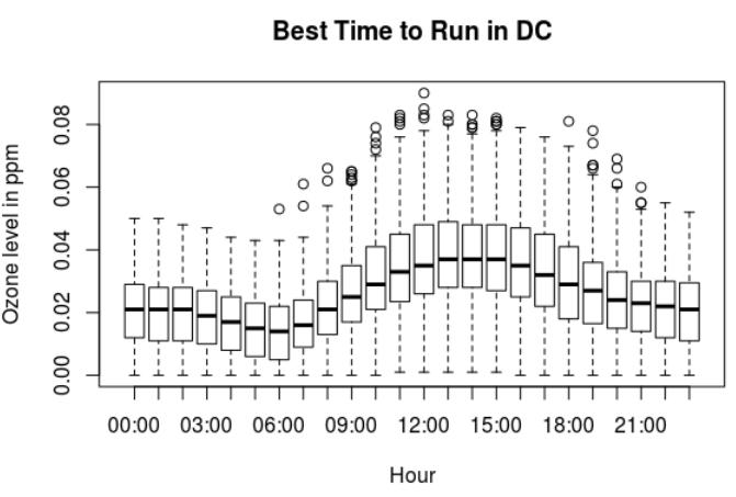
Ozone levels in Washington DC:
- The lowest ozone levels in Washington DC are between 5am to 7am.
- The highest ozone levels are from 9am until 7pm. With the highest around noon.
- At night there are lower ozone levels after 8pm.
The best time to run in Washington DC in the morning is between 5am and 7am. Then at night, after 8pm.
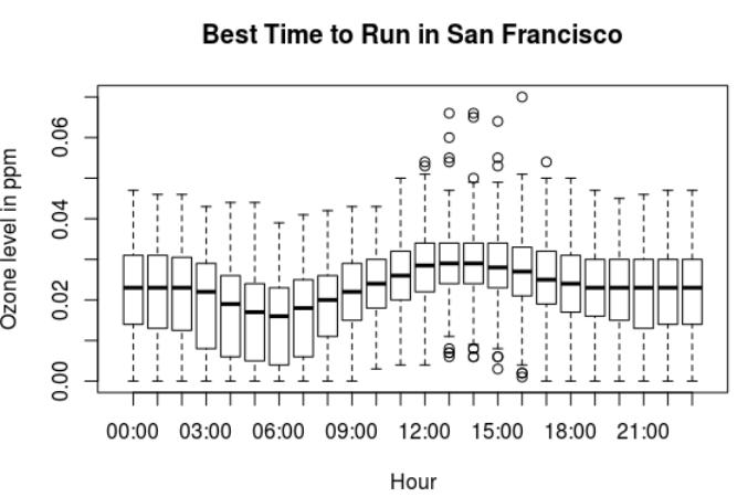
Best Time to Run in San Francisco
ca.counties <- filter(ozone, State.Name ==
    "California") %>% select(County.Name)
    %>% unique

View(ca.counties)

ozone.sf.2016 <- filter(ozone, County.Name ==
    "San Francisco") %>% select(Date.Local,
        Time.Local, Sample.Measurement)

plot(factor(ozone.sf.2016$Time.Local),
ozone.sf.2016$Sample.Measurement, main =
"Best Time to Run in San Francisco",
xlab = "Hour", ylab = "Ozone level in ppm")
> summary(ozone.sf.2016$Sample.Measurement)
   Min. 1st Qu.  Median    Mean 3rd Qu.    Max.
0.00000 0.01600 0.02300 0.02243 0.03100 0.07000
Ozone levels in San Francisco:
- The lowest ozone levels in San Francisco are between 5am and 7am.
- The highest ozone levels are between 12pm and 3pm.
The best time to run in San Francisco is between 5am and 7am. Then at night, after 7pm.
Best Time to Run in Los Angeles
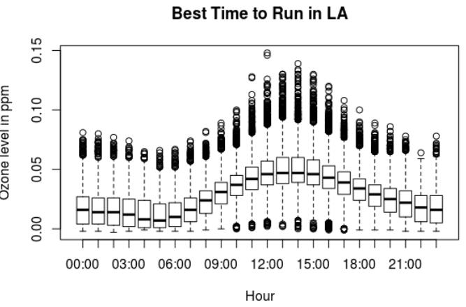
> summary(ozone.la.2016$Sample.Measurement)
    Min.  1st Qu.   Median     Mean  3rd Qu.     Max.
-0.00300  0.01300  0.02800  0.02864  0.04100  0.14800
Los Angeles has a very interesting plot. There are a lot of points away of the median, within the following ranges:
- 51-100. Moderate. Yellow
- 101-150. Unhealthy for sensitive groups. Orange
- 151-200. Unhealthy. Red
There is a maximum ozone measurement of 0.148. Which is very close to the Red range, aka “Everyone may begin to experience health effects; members of sensitive groups may experience more serious health effects.”
Ozone levels in Los Angeles:
- The lowest ozone levels in Los Angeles are between 4am and 6am.
- The highest ozone levels are between 11am and about 7pm.
- Then it drops around 9pm.
The best time to run in Los Angeles is between 4am and 6am. Don’t go out for a run between 11am and 7pm. Then you can try around 9pm.
Improving this analysis
- I wanted to plot a comparison of the ozone levels at multiple counties for a specific time. I wasn’t sure how to do this.
- I wonder if there is a positive correlation between corruption and air quality level.