Responsive Testing with Localhost and iPhone
I learned the hard way that the responsive design features from Chrome and Firefox developer tools are not an exact representation of the mobile interface.
My development laptop runs on Linux Fedora, 8GB RAM, and just 64GB of disk. No way to run an iPhone simulator. I had Android installed but it was taking way too much space.
I am on a quest to learn React Native to develop a set of ideas and get more hands-on experience developing apps, while also studying GCP, and following a product owner mindset. I recently completed a web design course with HTML, CSS, and JavaScript. I’ve been using Chrome and Firefox developer tools heavily to keep in mind the responsive design experience.
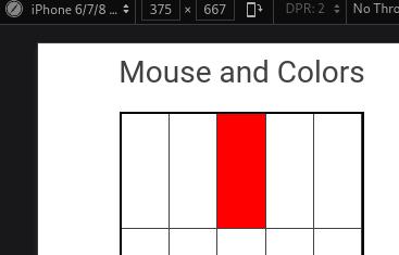
For my last exercise in JavaScript I made a grid that changes color when you mouse over a cell. When you double click on a specific cell it changes to a different color. It works well on the browser:
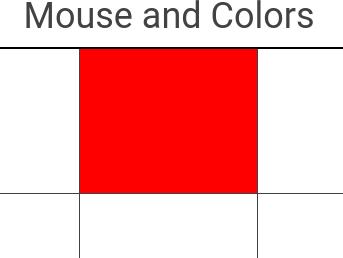
With Developer tools set to responsive design iPhone 6/7/8. Moving the mouse over the grid doesn’t do anything. However, you can click on a cell and the color changes. The behavior remains when you double click on a cell and it shows the correct programmed color.
Then I deployed the grid to my website. Tested this on Safari and the behavior was different. Touching a cell didn’t do anything. Double tapping the cell changed the color. Triple tapping the cell didn’t do anything. The behavior changed completely from web to mobile.
Why isn’t there a mobile simulator in Linux? Android is way too heavy and can’t install Xcode.
Access Localhost from iPhone
My next quest was a quick google away. I am sure you can access localhost from a phone. This took a lot of troubleshooting.
The quick answer is found on this Stackoverflow post.
- Find the local IP address of the computer
- From your phone browse to
IP:Port
If your localhost runs like this:
127.0.0.1:1234
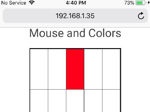
First you need to find the local IP number given to the laptop. Let’s say it is 192.168.1.35.
Then from mobile you can browse to:
192.168.1.35:1234
Port Number and Firewall
If this doesn’t work you can try enabling incoming traffic to the port number on your firewall.
This is for GNOME/Linux:
$ sudo firewall-cmd --state
running

$ firewall-cmd --help
Usage: firewall-cmd [OPTIONS...]

$ firewall-cmd --list-ports
1025-65535/udp 1025-65535/tcp

$ sudo firewall-cmd --add-port=1234/tcp

$ firewall-cmd --list-ports
1025-65535/udp 1025-65535/tcp 1234/tcp

$ sudo firewall-cmd --remove-port=1234/tcp

$ firewall-cmd --list-ports
1025-65535/udp 1025-65535/tcp
More about firewalld here.
Run localhost on 0.0.0.0
This is what worked for me. Running the server on 0.0.0.0.
More about the difference between 0.0.0.0 and 127.0.0.1 here
You can run your server like this:
$ python -m http.server 1234 --bind 0.0.0.0
Find the IP number of the laptop. Let’s say it is 192.168.1.35.
Then from your mobile (iPhone or Android or any).
Browse to:
192.168.1.35:1234
Now you can test your responsive design on your mobile.